Wrapping Angular Material button in custom Angular component (part 2)
This post is part of a series:
- Part 1 - Introduction, basic requirements, simple solution
- Part 2 - Refactoring the final solution from part 1
In the first part of this post we ended up with a simple but repetitive solution to wrapping Angular Material button in a custom component. In this post we’ll explore another way of solving the problem.
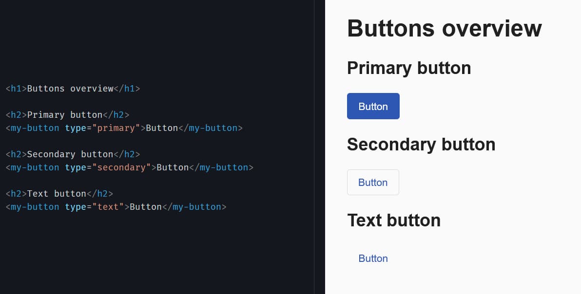
To remind you of what we ended up with in part 1, here’s the final solution again:
<!-- my-button.component.html -->
<ng-container *ngIf="type === 'primary'">
  <button mat-flat-button color="primary">
    <ng-container [ngTemplateOutlet]="buttonContent"></ng-container>
  </button>
</ng-container>

<ng-container *ngIf="type === 'secondary'">
  <button mat-stroked-button color="primary">
    <ng-container [ngTemplateOutlet]="buttonContent"></ng-container>
  </button>
</ng-container>

<ng-container *ngIf="type === 'text'">
  <button mat-button color="primary">
    <ng-container [ngTemplateOutlet]="buttonContent"></ng-container>
  </button>
</ng-container>

<ng-template #buttonContent>
  <ng-content></ng-content>
</ng-template>
The repetition here is quite obvious. Can we do something about it?
Solution 1
First, we can start by creating a component for each button type and move some of the code there. Imagine the following:
<!-- my-button.component.html -->
<primary-button *ngIf="type === 'primary'">
  <ng-container [ngTemplateOutlet]="buttonContent"></ng-container>
</primary-button>

<secondary-button *ngIf="type === 'secondary'">
  <ng-container [ngTemplateOutlet]="buttonContent"></ng-container>
</secondary-button>

<text-button *ngIf="type === 'text'">
  <ng-container [ngTemplateOutlet]="buttonContent"></ng-container>
</text-button>

<ng-template #buttonContent>
  <ng-content></ng-content>
</ng-template>
<primary-button>* component might look like this:
import { Component } from "@angular/core";

@Component({
  selector: "primary-button",
  template: `<button mat-flat-button color="primary">
    <ng-content></ng-content>
  </button>`,
})
export class PrimaryButtonComponent {}
* Note: <secondary-button> and <text-button> components are identical the only difference being that secondary button uses mat-stroked-button and text button uses mat-button directives.
The code was improved a tiny bit. Can we do better?
Solution 2
What if instead of using ngIfs to decide which button to show, we move that logic in the component’s class and use another Angular API to instantiate the relevant component dynamically?
Meet NgComponentOutlet. As written in the documentation, this directive provides a declarative approach for dynamic component creation. Declarative, meaning we tell Angular which component to instantiate and where to place it. The rest, like rendering it on the page, updating it on changes and destroying it, is handled by the framework.
Let’s see it in practice.
// my-button.component.ts
import { Component, Input } from "@angular/core";

import { PrimaryButtonComponent } from "../primary-button/primary-button.component";
import { SecondaryButtonComponent } from "../secondary-button/secondary-button.component";
import { TextButtonComponent } from "../text-button/text-button.component";

@Component({
  selector: "my-button",
  templateUrl: "./my-button.component.html",
})
export class MyButtonComponent {
  @Input() type: "primary" | "secondary" | "text" = "text";

  get buttonComponentType() {
    switch (this.type) {
      case "primary":
        return PrimaryButtonComponent;
      case "secondary":
        return SecondaryButtonComponent;
      case "text":
      default:
        return TextButtonComponent;
    }
  }
}
<!-- my-button.component.html -->
<ng-container
  *ngComponentOutlet="buttonComponentType; content: [[buttonContent]]"
></ng-container>

<div #buttonContent>
  <ng-content></ng-content>
</div>
The template is much cleaner now. There’s no repetitive logic. We send two properties to ngComponentOutlet - buttonComponentType, which holds the component that we want to instantiate, and content which takes a list of nodes to project into <ng-content> element(s) inside the component. buttonContent is a local variable that references the div element.
* Note: The type of content is any[][] hence the double square brackets around buttonContent. This also means that we can project more than one node elements into the component. The node can be any element that implements the Node interface like a text node, div, span, etc.
Demo time 🎉 (StackBlitz)
Well, visually the buttons still look the same but the code behind them is more organized. MyButton component is more flexible. We can easily add another button type by creating a new component and adding it to the switch statement.
In this post we looked at ngComponentOutlet and how it helps us dynamically create components to support a few basic requirements (outlined in part 1).
But things don’t have to stop here! MyButton component will rarely stay as it is right now. New use cases emerge all the time and some adjustments will be necessary. In part 3 we’ll introduce more requirements like icon support and disabled state.
Thanks to Lars Gyrup Brink Nielsen for reviewing this post.