How to add curves to your website
As front-end developers we’re usually the ones responsible for translating a design into code. And sometimes the designer wants to try something creative that breaks out of the rectangular shapes we’re so used to. So he/she decides to add some curves. It’s our job now to do magic and make them appear on the page.
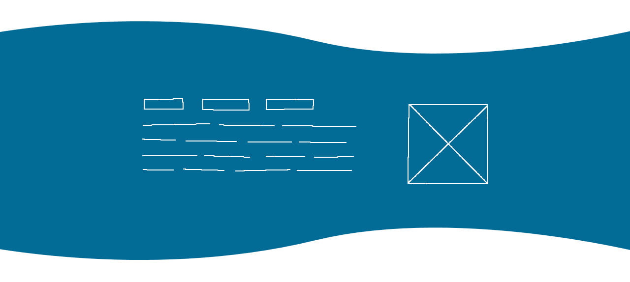
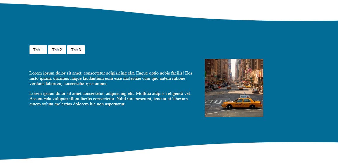
A couple of weeks ago I got a design that roughly resembled this one:
In this post I’m going to show you how to add curves to the top and bottom of an element. I’m going share my solution. You might have a different one. That’s fine! If you do, let me know on Twitter.
Before writing any code
It’s important to spend a bit of time thinking about the design. Try to come up with a strategy for how you’re going to approach it. What challenges are you possibly going to face? How will it look on mobile? On desktop? On wide screens? Can you make it flexible and reusable in other places? Are the techniques you want to use well supported or should you consider having a fallback?
Let’s briefly analyze the current task:
- The mockup can be divided in three parts - top curve, content, bottom curve. The top and bottom curves are purely for decoration. In case something happens and they don’t appear, the main content element should end up with straight lines. Nothing else should break.
- Looking at the curves more closely, I can see that they are in fact the same. The only difference is that one of them is flipped vertically. This helps me a lot here because I can export the curve only once and reuse it in both top and the bottom. We’ll see how in a bit.
- On wider screens the curves must go from edge-to-edge while the content can be centered.
Nice! Now let’s look at some code.
Adding the main content
This one is pretty straightforward and you’ve probably done it many times already. There’s a wrapper .container that goes full width and can be used for setting a background color and adding the curves. The .tabs-container is used for holding the content. This element will be centered on wider screens.
<div class="container">
  <div class="tabs-container">
    <!-- Some content here -->
  </div>
</div>
.container {
  background-color: #026b96;
}

.tabs-container {
  color: white;
  padding: 1.5rem;
}

@media (min-width: 980px) {
  .tabs-container {
    margin-left: auto;
    margin-right: auto;
    padding: 3rem 2rem;
    width: 800px;
  }
}
Here’s the result so far (CodePen):
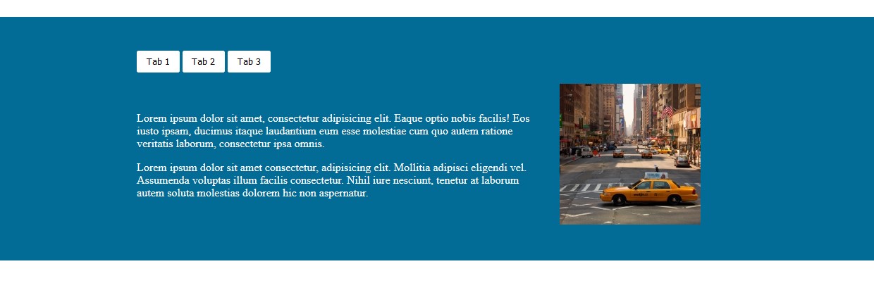
That’s a good baseline for now. Even if I don’t add the curves, everything still looks fine.
Adding the top curve
I already said that the curves are there only for decoration and making the element look more organic. So instead of adding them as img elements, which I’ve seen out in the wild, I’m going to add them using ::before and ::after pseudo elements. In order to have a curve that goes edge-to-edge on wider screens, I’ve exported it as a 3000x103px SVG image. This will still cause issues on super wide screens but it’s enough to illustrate the purpose of this post.
What is left now is adding the curve to the element:
.container {
  /* ... */
  position: relative;
}

.container::before {
  background: url("path/to/curve.svg") center bottom no-repeat;
  bottom: 100%;
  content: '';
  height: 103px;
  position: absolute;
  width: 100%;
}
There are a couple of points here:
- Because the
::beforeelement hasposition: absoluteit’s a good idea to set theposition: relativeon the.container. This will make the::beforeelement stay inside the.containerand thus becomes easier to move around. - The
backgrounddeclaration is interesting. There are a few things but the positioning (defined bycenter bottom) is the key. This specifies where to place the image relative to edges of the element.centerwill center the image on the x-axis, whilebottomwill place it on the bottom of the y-axis. You can play with different combinations.left bottomorright bottomare also valid. You can specify background-size as well. Try it and see the effect. - The
content: ''is quite important. Without it the element will not be generated. height: 103pxis the height of the SVG image. In your case that number might be different.bottom: 100%places the bottom edge of the element at the top edge of the.container. This is achieved by using a percentage value which is relative to the container’s height. Thanks to Andrew Bone for sharing this tip.
Here’s the result so far (CodePen):
Adding the bottom curve
Time for the final part. This is going to be fun.
I already said in the beginning that the bottom curve is the same as the top. The difference is that the bottom one is flipped. Luckily there’s a CSS property that can help us achieve that. Let’s have a look.
.container::before,
.container::after {
  background: url("path/to/curve.svg") center bottom no-repeat;
  content: '';
  height: 103px;
  position: absolute;
  width: 100%;
}

.container::before {
  bottom: 100%;
}

.container::after {
  top: 100%;
  transform: rotateX(180deg);
}
Much of the code from the previous step is repeated here as well. I’ve put all common declarations between the ::before and ::after elements together. That way I can make adjustments in only one place.
The most important code here is the transform property in the ::after element.
Using the rotateX() function I can rotate the image along its horizontal axis. This feels intuitive because the value is an angle and specifying 180deg as a value will flip it.
Note: In a previous version of this code I used scaleY(-1) to achieve the same thing. This works as well but, as Andrew Bone points out, rotateX() is more readable and easier to understand.
There’s one weird thing worth mentioning here. You might’ve noticed that the background image of the ::after element is set to center bottom. This is kinda strange because one would think the correct positioning should be center top since we move the element down but want to place its background image as close to the top as possible. center bottom is actually correct in this case because the element is flipped (remember rotateX(180deg)?), so its bottom is now on the top. You can observe this by setting the height and bottom to say 150px so the element is bigger than its background image.
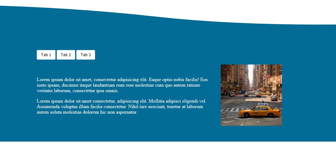
Here’s the final result (CodePen):
That’s it! Now you know how to add curves or other weird shapes to your website. Now go and get creative!
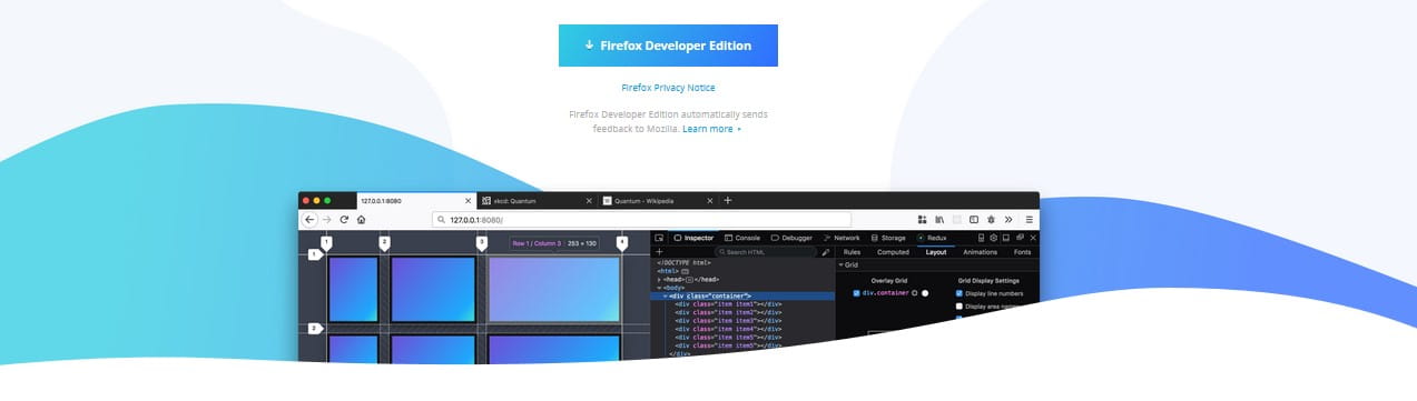
Here are a couple of examples if you’re in need of some inspiration.
Firefox Developer Edition (link)
Atlassian (link)

Do you have other techniques for adding curves/shapes? Let me know on Twitter.